I have recently started to learn Jetpack Compose, and honestly, I don't know why it took me so long because it's amazing and I have had a lot of fun coding in it. If you are looking to get started also I hope this article helps or you learn a thing or two.
Let me stop talking about my romance with Jetpack Compose and start the project.
What were a going to build
We are going to build the Main Screen for a leadership app. I got the inspiration on dribbble.com from Sulton Handaya, please check out their work here's the link to the shot. Link to the shot dribbble.com/shots/16907854-Leadership-Lear...
Here's a screenshot of the final app.
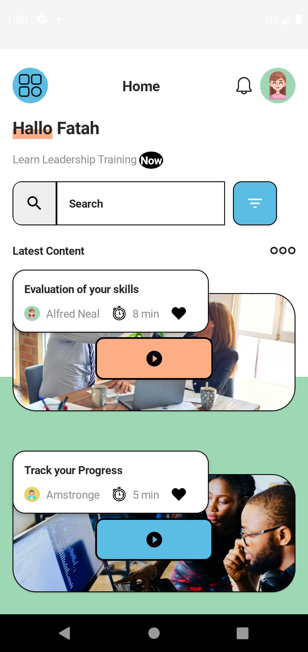
The final code is in Github github.com/fatahrez/MentorApp. Check out and If you like it give it a star 🙏
Start a new Compose project
To Start a Jetpack Compose project Go to Android Studio > File > New Project....
Then choose Empty Compose activity
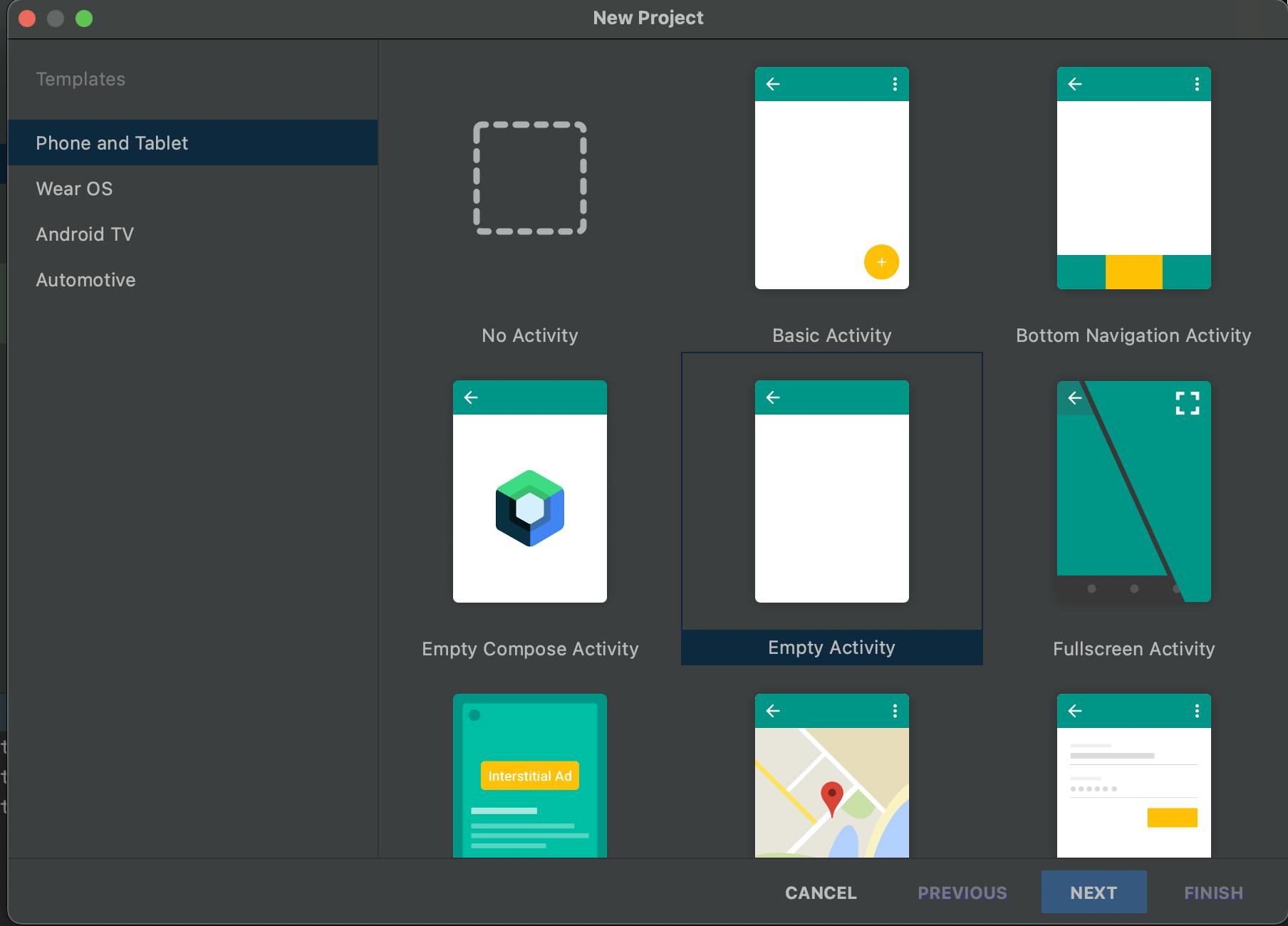
Go ahead and give your app a name and package name.
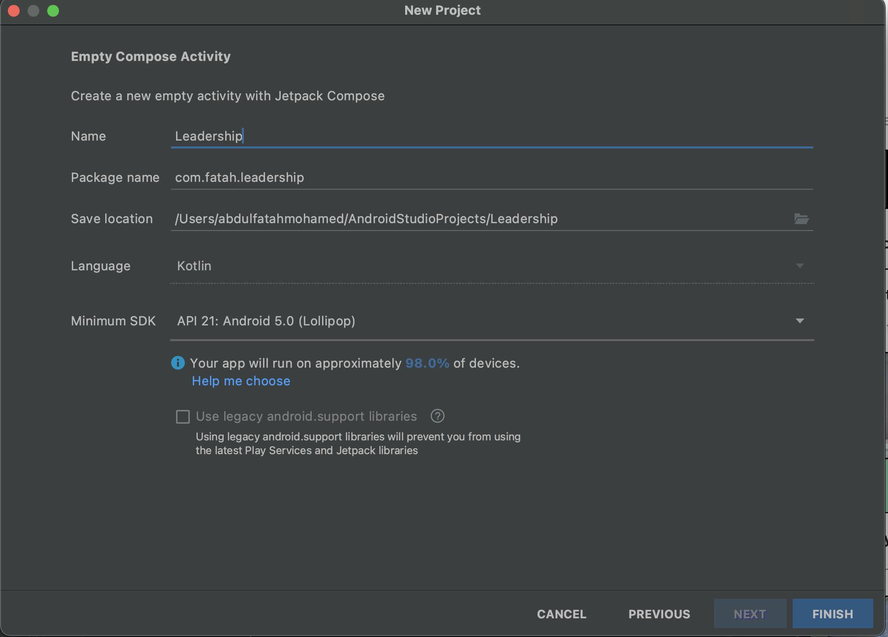
Make sure the language is Kotlin and the Minimum SDK is API 21. Just like in the photo above.
Fundamentals
Let's understand a few things first about Compose before getting started with the code.
- Jetpack Compose does not use XML layouts unlike the previous system of UI
what I like about this is that I no longer have to create custom drawable files for complex UIs which was like a lot of work. Also, I like that I do not have to switch between XML and Kotlin code like a hundred times to confirm different things. I think this helps my productivity as a software developer.
- Compose uses Composables to create blocks of UI elements Let's say you want to create Buttons on the same line this you will use a Composable because they are related. Composable looks something like this
@Composable
fun ContentSection(
    contents: List<Content>
) {
    Row (
        horizontalArrangement = Arrangement.SpaceBetween,
        verticalAlignment = Alignment.CenterVertically,
        modifier = Modifier.fillMaxWidth()
    ){
        Text(
            text = "Latest Content",
            style = MaterialTheme.typography.subtitle1
        )

        Box(modifier = Modifier.size(32.dp)) {
            val morePainter = painterResource(id = R.drawable.more)
            Icon(painter = morePainter, contentDescription = "more content")
        }
    }
    Spacer(modifier = Modifier.padding(4.dp))
    LazyColumn() {
        items(contents.size) {
            if (it == 0) {
                Spacer(modifier = Modifier.padding(top = 30.dp))
            }
            Log.i(TAG, "ContentSection: ")
            ContentBox(content = contents[it])
        }
    }
}
This for example is for the content section of an app. To display the content in a list. Ideally, in a Compose project, you will have a bunch of this.
If this sounds complex or greek don't worry I will explain in a few.
Coding the App
Now that you have your project set up and you know a little bit about Compose. Let's code our UI.
Start by creating a new Kotlin file and call it HomeScreen.kt
Top Menu Section
We want to create this part of the UI

We will start with defining our @Composable function. Our Code for the TopMenuSection will look like this.
@Composable
fun TopMenuSection() {
    Row (
        horizontalArrangement = Arrangement.SpaceBetween,
        verticalAlignment = Alignment.CenterVertically,
        modifier = Modifier
            .fillMaxWidth()
            .padding(top = 8.dp)
    ){
        Box (
            modifier = Modifier
                .size(45.dp)
                .clip(RoundedCornerShape(50))
                .background(ButtonBlue)
                .padding(8.dp)

        ){
            val painter = painterResource(id = R.drawable.menu)
            Icon(
                painter = painter,
                contentDescription = "menu"
            )
        }
        Text(
            text = "Home",
            style = MaterialTheme.typography.h2
        )
        Row (
            horizontalArrangement = Arrangement.End,
            verticalAlignment = Alignment.CenterVertically
        ){
            val bellPainter = painterResource(id = R.drawable.bell)
            val profilePainter = painterResource(id = R.drawable.woman)
            Box(
                modifier = Modifier
                    .size(25.dp)
            ) {
                Icon(painter = bellPainter, contentDescription = "Notifications")
            }
            Spacer(modifier = Modifier.padding(4.dp))
            Box(
                modifier = Modifier
                    .size(45.dp)
                    .clip(RoundedCornerShape(50))
            ) {
                Image(
                    painter = profilePainter,
                    contentDescription = "Profile",
                    Modifier
                        .background(SecondaryGreen)
                        .padding(4.dp)
                )
            }
        }
    }
}
P.S Note - For the images and drawable please find them here github.com/fatahrez/MentorApp/tree/master/a.. and here github.com/fatahrez/MentorApp/tree/master/a..
So what we have done here is that we have created a Row since all the items will be in the same straight-line(If were to arrange them vertically we would use Column). Inside the Row, we have started by creating a Box to in which we have put our Icon, we have a modifier with clip function to make it a Circle round it.
To put Text in Compose we use the Text() and simply pass through the text. e.g.
Text("Some text")
The text function also takes different things depending on your typography style. We put a Text for Home in the TopMenuSection
We have finally added another Row to align the last two items at the end which are an Icon for notification and an Image for the profile of the User. Try out the code above to check yourself.
Search Section
Now let's do the search section which looks like this
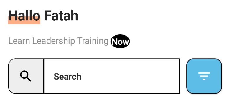
The code for this will look like this
@Composable
fun SearchSection() {
    Column {
        Row {
            Text(
                text = "Hallo",
                style = MaterialTheme.typography.h1,
                modifier = Modifier
                    .drawBehind {
                        val strokeWidth = 4.5.dp.toPx() * density
                        val y = size.height - strokeWidth / 2

                        drawLine(
                            ButtonOrange,
                            Offset(0f, y),
                            Offset(size.width, y),
                            strokeWidth
                        )
                    }
            )
            Text(
                text = " Fatah",
                style = MaterialTheme.typography.h1
            )
        }
        Spacer(modifier = Modifier.padding(8.dp))
        Row {
            Text(
                text = "Learn Leadership Training ",
                style = MaterialTheme.typography.body1
            )
            Text(
                text = "Now",
                style = MaterialTheme.typography.subtitle2,
                modifier = Modifier
                    .drawBehind {
                        drawOval(
                            color = Color.Black
                        )
                    }
                    .padding(1.5.dp)
            )
        }
        Spacer(modifier = Modifier.padding(8.dp))
        Searchbar()
    }

}
Don't worry about the SearchBar error we will make another Composable function for it.
Since we need to draw under the word Hallo we have put the text in a row. We have done something interesting for the word Hallo we decide to use a Modifier and draw a line under it using the drawBehind capability of Modifier. We have also the same for the "Now" text where we have drawn an oval behind it.
SearchBar Section
Now that our UI is coming together, Noicee.
Let's add the searchbar now
@Composable
fun Searchbar() {
    var textFieldState by remember {
        mutableStateOf("")
    }
    Row {
        Row (
            modifier = Modifier.clip(RoundedCornerShape(12.dp))
        ){
            Button(
                onClick = {},
                shape = RoundedCornerShape(20, topEndPercent = 0, bottomEndPercent = 0, 20),
                border = BorderStroke(0.75.dp, color = Color.Black),
                colors = ButtonDefaults.buttonColors(contentColor = Color.Black, backgroundColor = ButtonGrey),
                modifier = Modifier
                    .size(56.dp)
            ) {
                val searchPainter = painterResource(id = R.drawable.outline_search_24)
                Icon(painter = searchPainter, contentDescription = "search")
            }
            TextField(
                value = textFieldState,
                onValueChange = {
                    textFieldState = it
                },
                label = {
                        Text(text = "Search")
                },
                shape = RoundedCornerShape(0, 20, 20, 0),
                singleLine = true,
                colors = TextFieldDefaults.textFieldColors(
                    backgroundColor = Color.White
                ),
                modifier = Modifier
                    .width(215.dp)
                    .border(0.75.dp, color = Color.Black)
            )
        Spacer(modifier = Modifier.padding(5.dp))

        }

        Button(
            onClick = { /*TODO*/ },
            shape = RoundedCornerShape(20),
            border = BorderStroke(0.75.dp, color = Color.Black),
            colors = ButtonDefaults.buttonColors(contentColor = Color.White, backgroundColor = ButtonBlue),
            modifier = Modifier
                .size(56.dp)
        ) {
            val filterPainter = painterResource(id = R.drawable.outline_filter_list_24)
            Icon(painter = filterPainter, contentDescription = "painter")
        }

    }
}
So what we have done here is put all the elements in a row since they will be in the same line. We draw the Button with an icon to show search then add a TextField to show our searchbar then finally add the filter button on the end.
ContentSection
Here's how our content section will look like
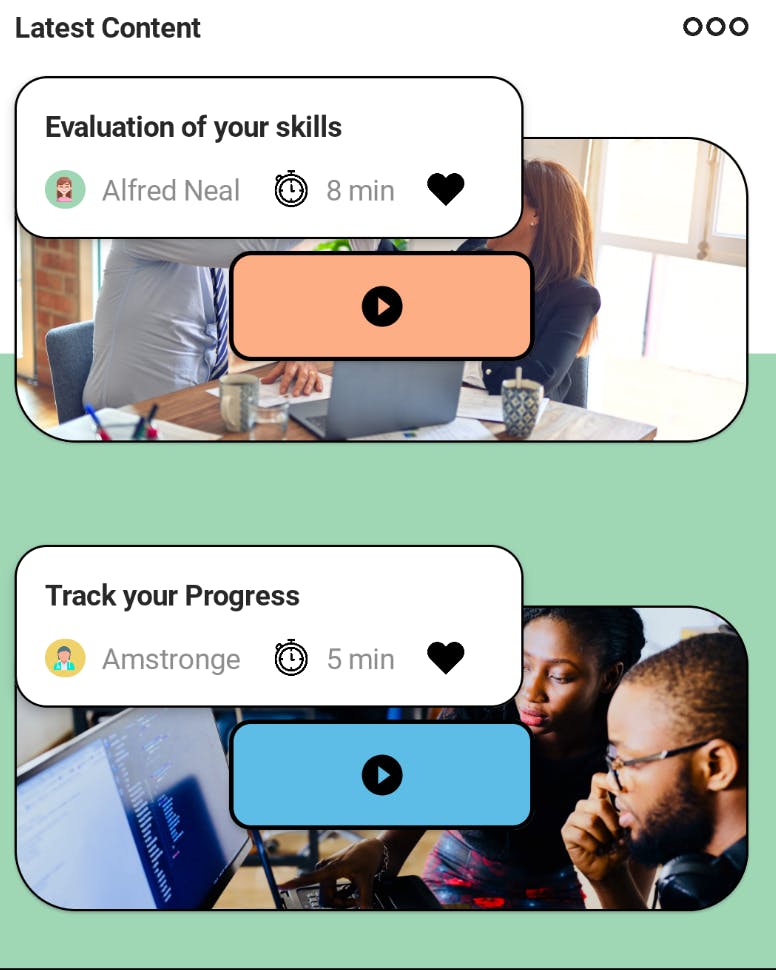
Let's paste the code and discuss it after
@Composable
fun ContentSection(
    contents: List<Content>
) {
    Row (
        horizontalArrangement = Arrangement.SpaceBetween,
        verticalAlignment = Alignment.CenterVertically,
        modifier = Modifier.fillMaxWidth()
    ){
        Text(
            text = "Latest Content",
            style = MaterialTheme.typography.subtitle1
        )

        Box(modifier = Modifier.size(32.dp)) {
            val morePainter = painterResource(id = R.drawable.more)
            Icon(painter = morePainter, contentDescription = "more content")
        }
    }
    Spacer(modifier = Modifier.padding(4.dp))
    LazyColumn() {
        items(contents.size) {
            if (it == 0) {
                Spacer(modifier = Modifier.padding(top = 30.dp))
            }
            ContentBox(content = contents[it])
        }
    }
}

@Composable
fun ContentBox(
    content: Content
) {
    Column() {
        Card(
            modifier = Modifier
                .fillMaxWidth(),
            shape = RoundedCornerShape(20),
            border = BorderStroke(1.dp, color = Color.Black)

        ) {
            Box(
                modifier = Modifier.fillMaxSize()
            ) {
                Image(
                    painter = rememberImagePainter(
                        data = content.image
                    ),
                    contentDescription = content.title,
                    contentScale = ContentScale.Crop,
                    modifier = Modifier
                        .height(150.dp)
                        .fillMaxWidth()
                )
                Button(
                    onClick = {},
                    modifier = Modifier
                        .height(70.dp)
                        .width(150.dp)
                        .padding(top = 16.dp)
                        .align(Alignment.Center),
                    colors = ButtonDefaults.buttonColors(
                        backgroundColor = content.background,
                        contentColor = Color.Black
                    ),
                    border = BorderStroke(2.dp, Color.Black),
                    shape = RoundedCornerShape(20)
                ) {
                    val painter = painterResource(id = R.drawable.outline_play_circle_filled_24)
                    Icon(painter = painter, contentDescription = "play")
                }
            }
        }

        Card(
            shape = RoundedCornerShape(20),
            border = BorderStroke(1.dp, color = Color.Black),
            elevation = 4.dp,
            modifier = Modifier.offset(y = (-180).dp)
        ) {
            Box(
                modifier = Modifier
                    .size(250.dp, 80.dp)
                    .padding(15.dp)
            ) {
                Column {
                    Text(
                        text = content.title,
                        style = MaterialTheme.typography.subtitle1
                    )
                    Spacer(modifier = Modifier.padding(6.dp))
                    Row {
                        Box(modifier = Modifier
                            .size(20.dp)
                            .clip(RoundedCornerShape(50))
                            .background(content.publisherIconBackground)
                            .padding(3.dp)
                        ) {
                            val publisherIcon = painterResource(id = content.publisherIcon)
                            Image(painter = publisherIcon, contentDescription = content.publisher)
                        }

                        Spacer(modifier = Modifier.padding(4.dp))

                        Text(
                            text = content.publisher,
                            style = MaterialTheme.typography.body1
                        )

                        Spacer(modifier = Modifier.padding(8.dp))

                        Box(modifier = Modifier.size(18.dp)) {
                            val timeIcon = painterResource(id = R.drawable.chronometer)
                            Image(painter = timeIcon, contentDescription = content.time)
                        }

                        Spacer(modifier = Modifier.padding(4.dp))
                        Text(
                            text = content.time,
                            style = MaterialTheme.typography.body1
                        )

                        Spacer(modifier = Modifier.padding(8.dp))
                        Box(modifier = Modifier.size(18.dp)) {
                            val heartIcon = painterResource(id = R.drawable.heart_black)
                            Image(painter = heartIcon, contentDescription = content.time)
                        }
                    }
                }
            }
        }
    }
}
Here we have 2 Composables. The first one ContentSection which takes in a List of our content. For this, we need to create a data class that looks like this.
data class Content (
    val title: String,
    val publisher: String,
    @DrawableRes val publisherIcon: Int,
    val publisherIconBackground: Color,
    val time: String,
    val liked: Boolean,
    val image: String,
    val background: Color
)
We will need this to create a dynamic list of the content, kind of like getting data from API to show different content and views.
For the ContentSection we start with a Row that takes in the title "Latest Content" and an Icon to show more data.
After that, we create a LazyColumn(Which is preferred over Columns when displaying a large list of data because they are more efficient). Inside the LazyColumn we loop through the list of Content while parsing each inside a ContentBox.
Our next Composable is the ContentBox here we have done a bunch of stuff. We have started with the Card that looks second on the eye. Inside the card, we put an Image and pass it in our image using painter for this we require the Coil dependency to add it use app build.gradle.
implementation("io.coil-kt:coil-compose:1.4.0")
We also add a button and align it in the center.
For the second card in order for it to appear above the first we Modifier.offset(y = (-180).dp). We move its y-axis above so that it shows above the other card. We pass in the text as content.title. Also adding all the icons from using our content data class.
Now we are done with all the sections ...
Bringing it all together
Now we need to content all our sections and oh make our the last 3rd of our screen Green.
Create a new drawable in the same file HomeScreen.kt
@Composable
fun HomeScreen() {
    BoxWithConstraints(
        modifier = Modifier
            .fillMaxSize()
    ) {
        val width = constraints.maxWidth
        val height = constraints.maxHeight

        val greenPoint1 = Offset(width.toFloat(), height*0.58f)
        val greenPoint2 = Offset(-width.toFloat(), height * 0.58f)

        val greenColoredPath = Path().apply {
            moveTo(greenPoint1.x, greenPoint1.y)
            standardQuadFromTo(greenPoint1, greenPoint2)
            lineTo(width.toFloat() + 100f, height.toFloat() + 100f)
            lineTo(-100f, height.toFloat())
            close()
        }

        Canvas(modifier = Modifier.fillMaxSize()) {
            drawRect(
                color = SecondaryGreen,
                topLeft = greenPoint2
            )
        }

        Column (
            modifier = Modifier.padding(16.dp)
        ){
            TopMenuSection()
            Spacer(modifier = Modifier.padding(8.dp))
            SearchSection()
            Spacer(modifier = Modifier.padding(8.dp))
            ContentSection(
                listOf(
                    Content(
                        "Evaluation of your skills",
                        "Alfred Neal",
                        R.drawable.woman,
                        SecondaryGreen,
                        "8 min",
                        false,
                        "https://images.unsplash.com/photo-1600880292203-757bb62b4baf?ixlib=rb-1.2.1&ixid=MnwxMjA3fDB8MHxwaG90by1wYWdlfHx8fGVufDB8fHx8&auto=format&fit=crop&w=2340&q=80",
                        ButtonOrange
                    ),
                    Content(
                        "Track your Progress",
                        "Amstronge",
                        R.drawable.female_doctor,
                        AlternateYellow,
                        "5 min",
                        true,
                        "https://images.unsplash.com/photo-1531482615713-2afd69097998?ixlib=rb-1.2.1&ixid=MnwxMjA3fDB8MHxwaG90by1wYWdlfHx8fGVufDB8fHx8&auto=format&fit=crop&w=2340&q=80",
                        ButtonBlue
                    )
                )
            )
        }
    }
}
We start by placing a BoxWithConstraints (This is a box that is fixed in position kind of like in ConstraintLayout in XML) and we let fillMaxSize using a modifier. The BoxWithConstraints helps us get the height and width easily.
Now we go ahead and specify the last third using Offset points in order to draw a rectangle using the Canvas function which we give the Color Green.
After we have done this We create a Column to pass in all our Sections. In our ContentSection, we pass listOf Content and populate it just like in the code above.
Summary
In my opinion, doing this using XML would be a lot more difficult. And that's why I love Jetpack Compose.
If you need the full code for the project check it out on Github github.com/fatahrez/MentorApp. Be sure to give it a star ⭐️🤩
If this was helpful reach out to me on Twitter. Follow me on Github for more projects like this.